Overview
CL Ventures (CL = Concept Launch) began as my solopreneur initiative to help business owners launch faster, whether through prototype developments, landing websites that convert, or pitch decks to secure funding.
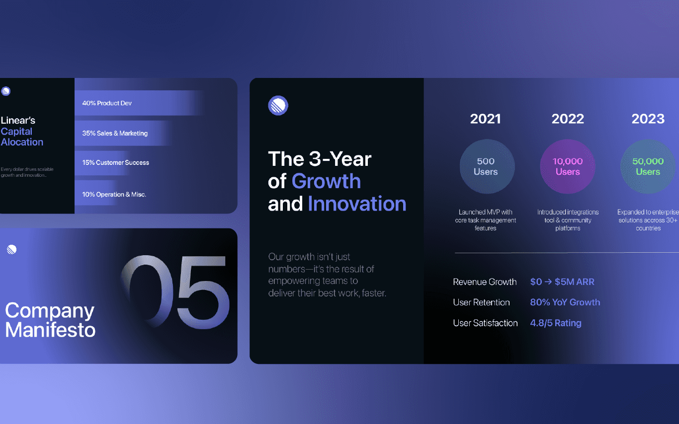
Creating executive-ready presentation decks was one of CL Ventures' most outstanding offerings; this service excites me to explore via this case study. Here I showcase the methodical process I used to create strong and convincing presentation decks decks that enable founders to get buy-in from stakeholders and investors both.
My contribution
Consultant
Deck Designer
The team
Individual Effort
Year
2022 - Present

My Approach to Exec-Ready Presentations
Entrepreneurs often struggled to distill complex business models, innovative solutions, or ambitious visions into clear, compelling narratives for investors. (I know this because I ran a startup before) They needed presentation decks that didn’t just inform but persuaded, while addressing the core questions investors always ask:
Why this problem?
Why your solution?
Why now?
Why you?
I applied a structured approach to crafting pitch decks, centered on four critical areas:
The 'Slide Structure'
Every great pitch deck begins with a foundation strong enough to hold attention and spark curiosity. To achieve this, I always started with the answer. By putting the conclusion first, such as the size of a market opportunity or the uniqueness of a value proposition, I ensured the audience was hooked from the outset. Each subsequent slide then built upon this claim, layering proof points and insights in a logical, cascading manner.
But simplicity wasn’t enough, slides that didn’t contribute to the core narrative were ruthlessly eliminated. "Does this slide truly add value?" became a question I frequently posed to clients. If the answer wasn’t a resounding yes, it was cut. Moreover, the pitch decks needed flexibility. For live presentations, visuals were lean and designed for dynamic discussions. For standalone decks, I included richer context to ensure the slides could stand alone as a compelling story.
The 'Messaging'
In pitch decks, complexity is often the enemy of clarity. Charts and visuals might impress, but they can just as easily overwhelm. I prioritized simplification - distilling overly detailed charts into clean bar graphs or concise tables that allowed the most critical data to shine. Decision-making about what to include wasn’t easy; it required bold tradeoffs. I guided clients to focus on impactful metrics, resisting the temptation to include extraneous details.
But numbers alone aren’t enough.. context is everything. A 20% growth figure may seem impressive on its own, but when framed against industry benchmarks or competitor performance, it becomes a powerful story. This added layer of relatability helped investors understand not just the data but its significance.
The 'Headline'
On a slide, the headline captures the major point rather than merely providing a title. Before even designing content, I worked with clients to craft headlines that captured the essence of each slide. For example, instead of "Revenue Breakdown," a headline like "$10M Revenue Growth Driven by Regional Expansion" conveyed both insight and intrigue. The tone of these headlines shifted depending on the audience.
Angel investors, for instance, preferred visionary and bold statements that evoked excitement. Venture capitalists, however, often needed a more measured tone, one that acknowledged potential risks while emphasizing mitigation strategies. Headlines avoided generic labels and offered real commentary. Each one transformed information into an argument, ensuring the story felt cohesive and intentional.
The 'Visual Aids'
Visuals can make or break a pitch deck. To keep the focus on what mattered, I employed callout boxes and annotations that highlighted key insights. This technique ensured the audience didn’t miss the most critical takeaways within a slide. Tables, often a staple in pitch decks, posed a unique challenge. Raw data tables are functional but can easily appear cluttered and uninviting. I revamped them into streamlined layouts: clean, minimalist, and professional, making them far more digestible.
Finally, the strategic use of color added another dimension of clarity. Green signified growth or opportunity, yellow highlighted areas needing caution, and red underscored risks or gaps. This color coding wasn’t just aesthetic, it reinforced the narrative, helping the audience quickly grasp the key points of the story.
Outcome
Looking back on all creativity juice I've squeezed, I see just how much this process has influenced my own growth. Creating pitch decks has shown me how to think beyond just being a service provider; I got better as a storyteller and a strategic advisor too.
I really got to dive into audience psychology, learn about the little things that make persuasion work, and see just how crucial it is to be clear when time is running out.
These are also principles I apply to all areas of my work, especially in product management. It's all about bringing together different stakeholders and communicating well, which is key to achieving success.
Two stats I'm proud of:
Clients secured a cumulative RM700,000 total in funding using decks I crafted.
Two of my clients have established their own physical headquarters since securing funding


