Overview
When my client first shared their idea with me, they already had a clear vision: they wanted to build an app designed to help people stay connected with friends and family through gentle, thoughtful reminders.
The problem they were trying to solve was deeply relatable, and the concept made sense. But before they invested time and money into development, they hit a common but critical question:
“How do we know if people will actually use this before we build the whole thing?”
They weren’t looking for someone to brainstorm features or map out technical specs - they needed clarity. They wanted answers to two big questions:
Is this a problem people care enough about to download and use an app for?
Will people stick with it, or will it become just another app collecting dust on their phones?
At this point, they needed a structured way to test their idea and gather meaningful insights. That’s where I came in to help design a validation process that would give them real answers without having to build the full product first.
My contribution
Web Development
Product Demo
Product Analytics
The team
1 x Marketing Lead
1 x Product Manager
Year
2024

The Plan
Instead of jumping straight into app development, I focused on building a lean validation strategy. Here’s what we set out to do:
Create a legit and strong brand. Rekindl: Focuses on reigniting connections, with a fresh, tech-style spelling.
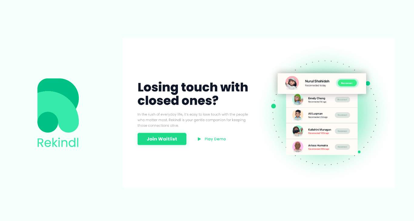
Build an engaging landing page with an interactive demo.
Test the waters on the right platforms.
Why This Approach?
First impressions matter. The branding needed to feel warm, relatable, and approachable. We wanted people to immediately “get” what the app was about, which is a tool for thoughtful connection, not just another productivity app.
For the landing page, instead of overwhelming visitors with technical jargon or endless feature lists, the page focused on a simple question: “Do you feel like you’re losing touch with people who matter to you?” It spoke to the emotional core of the problem and positioned Rekindl as an effortless solution.
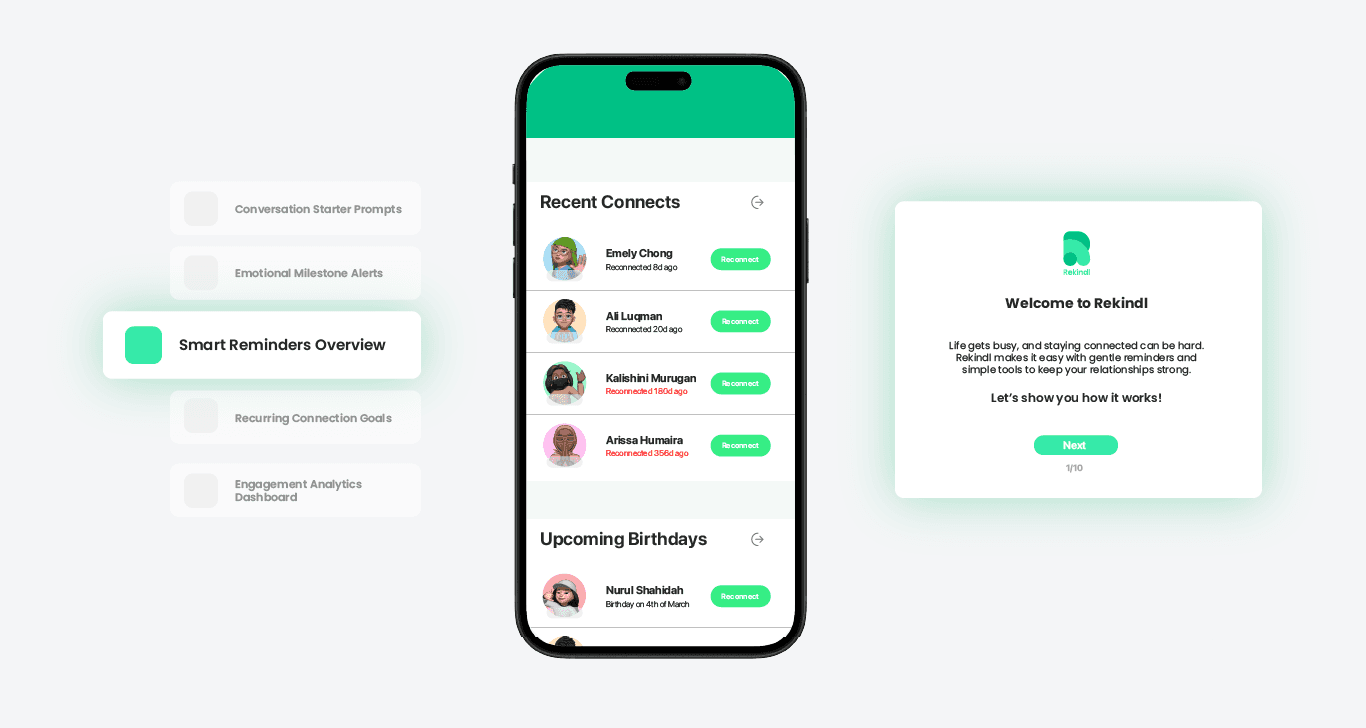
For the demo, Words can only do so much - I developed a mini interactive demo that simulated how reminders would work and how easy it’d be to use the app.
Platforms for Testing:
LinkedIn: Professionals are often the ones who feel this problem most acutely.
Indie Hackers: This community offers raw, constructive feedback.
The overall structured plan was to find out if people cared - Will they make sense in light of the issue & use the app?

The Core Collateral - Product Demo
The client came to me with a long list of potential features. Some were ambitious, others were clever. But validation is about focus. Instead of testing everything, I zeroed in on three core features that represented the heart of the idea:
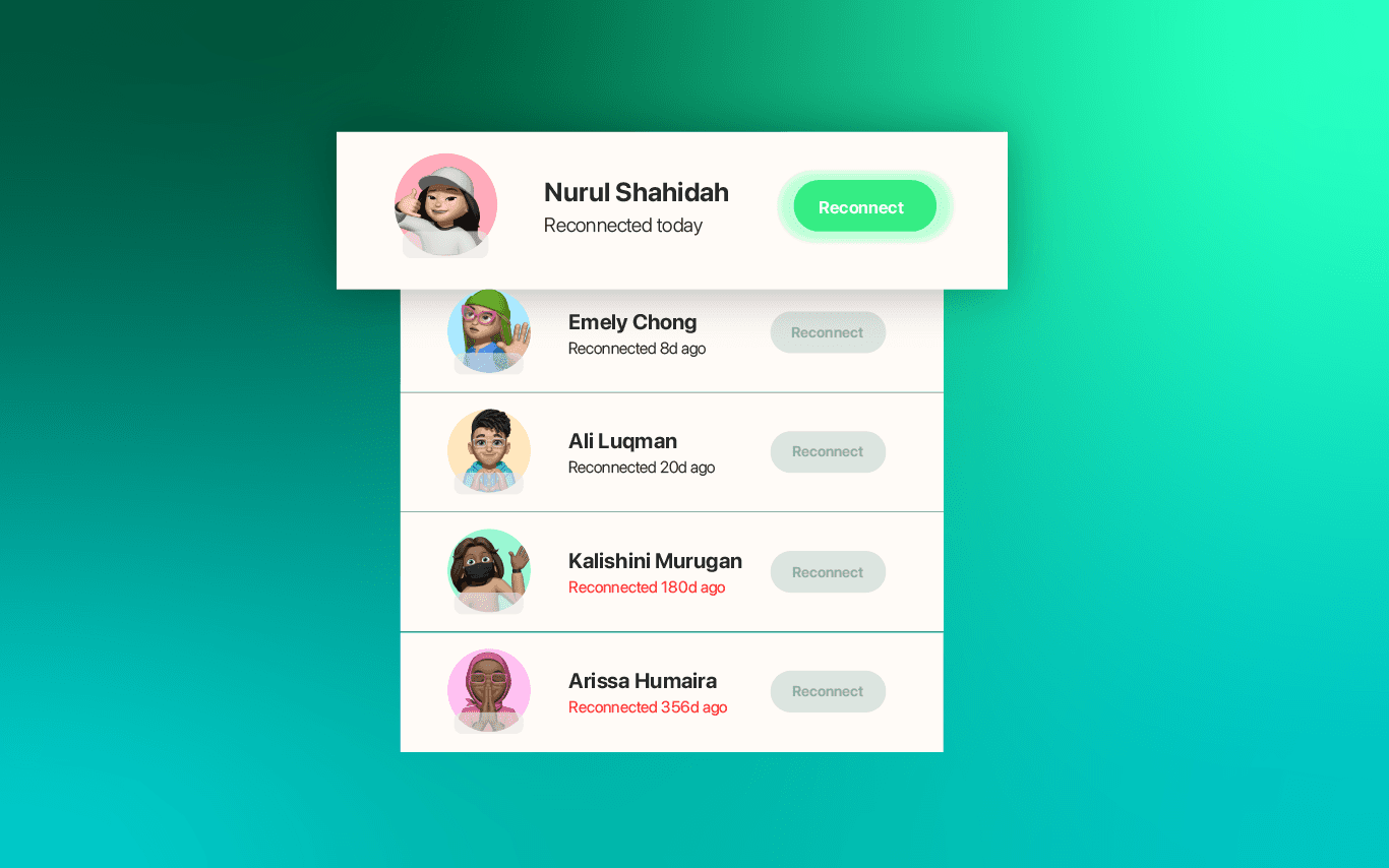
Personalized Reminders: Gentle, tailored nudges to reach out to specific people (e.g., “You haven’t called Sam in two weeks.”).
Interaction Timeline: A visual snapshot of when you last connected with each person, making it easy to spot gaps.
Prompt Suggestions: Little conversation starters to reduce the friction of reaching out after a long time.
These were the clearest expression of the app/idea's promise: Help people remember, act, and nurture their connections effortlessly.
To make this happen, I used Arcade, a tool designed for creating interactive product demos.
The Pros of Arcade
Interactive, Not Static: Instead of showing static screens or clickable mockups, Arcade allowed us to simulate real interactions. Users could click through, explore settings, and experience the app’s core features firsthand.
Quick to Build: Arcade made it easy to spin up a functional demo without heavy development work, keeping the validation process lean and efficient.
Easy Sharing: The demo was shareable via a simple link, making it seamless to embed in the landing page and share across our marketing channels.
I was able to build a demo that felt polished and engaging, something users could click through and immediately understand the value of the app without us needing to explain it in paragraphs of text.

Metrics Measured
To understand if we were on the right track, we focused on four key metrics:
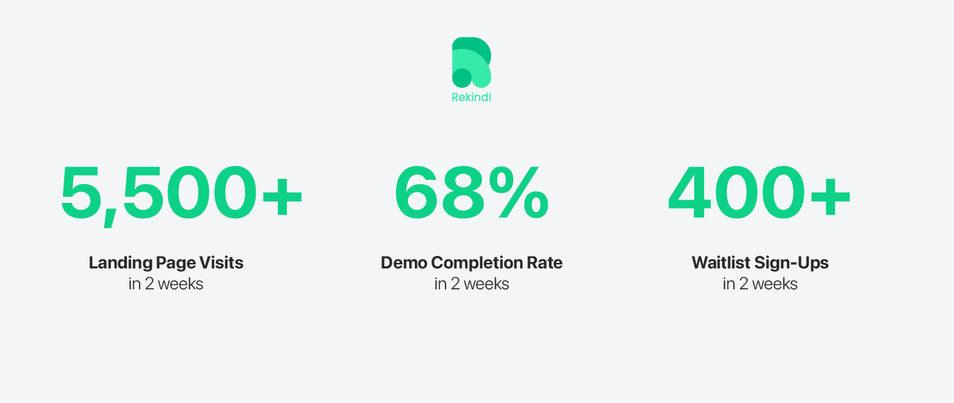
Website Visits: How many people felt curious enough to click through to the landing page?
Demo Completion Rate: Did visitors actually go through the interactive demo, or did they lose interest midway?
Waitlist Sign-Ups: Were people convinced enough to leave their email and say, “Let me know when this launches”?
Survey Responses: After signing up for the waitlist, users received a short survey with a simple incentive—6 months of free premium access if the app launched.
The survey aimed to dig deeper:
Why did you sign up?
How often do you think you’d use something like this?
What might stop you from using it regularly?
Every interaction, every click, every response; all of them were considered part of the validation about whether the idea had the potential to stick.
The Verdict
The results came in, and on the surface, they painted a pretty promising picture:

But the most revealing insights came from the survey responses, which we sent to everyone who joined the waitlist (with an incentive of 6 months free premium access if the app launched). Here’s what we learned:
Why They Might Stop Using It:
“I might feel overwhelmed by reminders.” (35%)
“I might forget about the app entirely.” (30%)
“I’d rather have these reminders integrated into tools I already use, like my calendar.” (20%)
Feature Feedback:
Personalized reminders were highly appreciated, but several respondents mentioned they’d prefer more flexibility, like being able to set reminders based on emotional triggers (e.g., birthdays, anniversaries) instead of just time intervals.
Prompt suggestions received mixed reviews. Some loved the conversation starters, while others felt they were too generic to add real value.
The Client's Decision
On paper, these numbers and insights looked like enough to move forward. But the client made an observation that changed everything: Are we trying to change human behavior?” It was clear the idea was an attempt to solve something deeply personal and habitual: the way people manage emotional connections in their lives.
The survey data revealed an underlying truth: while people wanted to stay connected, they weren’t fully convinced an app would become their go-to solution.
Behavioral Friction: Users worried about reminder fatigue. They didn’t want staying in touch to feel like an obligation.
Emotional Barriers: Some users felt reaching out after a long time was awkward, and no app could fully address that discomfort.
Integration Concerns: Users wanted reminders integrated into tools they already use, like their calendar or task managers - not siloed in a separate app.
The client made a bold, thoughtful decision: Don’t build it.
Not because the idea was bad, but because the execution would require solving deep behavioral challenges that an app alone might not be able to address.
And honestly? That’s still a win. Instead of sinking months into building a product that might have faded after launch, the client walked away with actionable insights and clarity; no wasted time, no sunk costs, and no regrets.
Outcome
3 Takeaways from This Validation Process:
Design Matters, A LOT: Every touchpoint, from the landing page to the demo, needs to feel polished and “launch-ready.” People judge a product’s potential by how professional it looks.
Emotional Buy-In Isn’t Enough: People might love an idea, but sustained usage depends on whether it fits naturally into their habits.
Define Success Upfront: Know what signals you’re looking for before you start. Are you chasing sign-ups? Engagement? Survey responses? Clear targets make decision-making easier.
Validating an idea isn’t about proving you’re right - it’s to discover the truth as quickly and efficiently as possible. We learned that the problem was real. People do feel disconnected, and they do want help staying in touch. But turning that into a product people use consistently? That’s a harder nut to crack.
And that’s okay.
The beauty of early validation is that it saves time, money, and energy. Instead of spending months building an app that might have quietly faded away, we walked away with clarity, and clarity is valuable.

